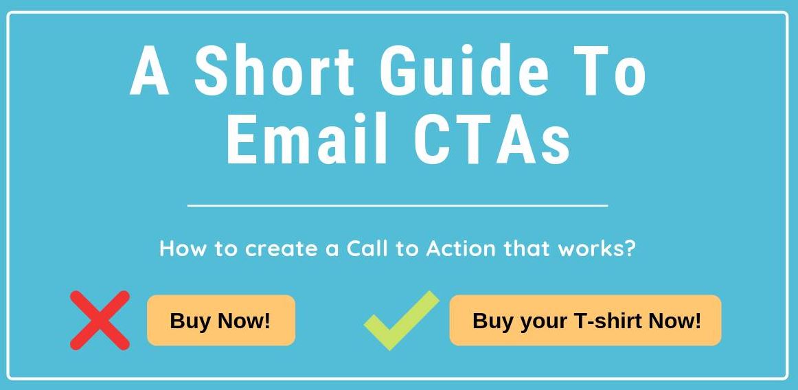
How to create a Call to Action that works?
Every email has a purpose.
And every marketer and online business owner understand the importance of getting people to interact with their email campaigns.
The only way to accomplish that purpose is by getting your subscribers out of their inbox and guide them to your landing page.
That’s why the call-to-action, or CTA, is so critical! ⚠️
You can’t just drop a button anywhere in your email and expect outstanding conversions, though. There are a number of ground rules to keep in mind when designing and implementing a CTA.
The best CTAs are more than just a nice button with some catchy text. The truth is that every element of your email contributes to making the CTA work.
➡️ WHERE TO PUT IT?
It’s important to note that there are lots of different types of email formats and layout options, which affect the placement of your CTAs.
So in this short guide, I will only cover some basic thumb rules to follow. 👍
For emails that have one clear goal with one CTA, the placement should follow the logical progression of the story or message of your email.
People read from the top left to right of an email, so it makes sense to place your CTA buttons towards the middle or to the right of the content.
You also want your main CTA to be seen quickly! 👀
Placing it early in the email is a good way to ensure this. Keep your main CTA towards the top of the email for readers that are not likely to scroll.
And don’t forget that readers not only click on the CTA buttons. People often try to click different elements in the email like the logo, headlines, and images. So adding the same link to those elements is always a good idea.
➡️ WHAT TO WRITE?
The biggest mistake that people make is using weak and passive language in their CTA.
Read more.
Click here.
Download.
Buy now.
Everyone has seen these CTA phrases a billion times. The web is filled with these kinds of bad call to actions. 🚫
For example, here is Read more. – About what? Make it specific, what’s there behind the link.
Call it what it does!When calling the subscribers to action, instead of the above mentioned vague words, use brief but meaningful text that explains what the link or button offers.
For example, ‘get my 20% coupon’ or ‘try a free sample’ work much better because they use an inviting action verb with something concrete for the reader.
Also, avoid CTAs like ‘click here and use your coupon code’ or ‘learn more about how we got started’. Avoid the click and learn more part, they’re just simply unnecessary – use just ‘use your coupon code’ or ‘how we got started’.
➡️ DESIGN
The best way to get more clicks is to include a button. Sounds obvious, but some people prefer to use links or images as their CTA.
1️⃣ Don’t use just images!
Because of image-blocking, image-based CTAs are not recommended to use. 🏴☠️
If your CTAs are contained within images, there is a good chance that many subscribers will miss out on your message.
2️⃣ When designing any CTA button, it’s important to think about how it will contrast with the surrounding content.
Take a look at your email design and choose a button color that will stand out. The goal is to make the email cohesive while still ensuring the CTA button is the most eye-catching color on the screen.
3️⃣ Make them more interactive with using a drop shadow to look more alive or you can make the button change colors and depth when the mouse hovers over it.
4️⃣ Less is more!If you have too much crowd in your email, the CTA will be hard to find no matter how bright or big.
Always make sure there is enough white space around your buttons to avoid any visual noise.
There is a lot of other consideration when it comes to making your email CTAs as effective as possible. For example the size of your CTA buttons, the number of CTAs or how to use directional clues. ℹ️
But the most important things to focus on are the placement, the wording and the design. If those are all in place then you are already on the right path! 😉
